
T H R E D U P
Empowering sellers with a new listing flow
The Challenge
ThredUP is an online consignment and thrift store with a website and mobile app. They have a stellar shopping experience with a ton of helpful filters to match you to relevant items, and offer a free, easy way to send in clothes to sell or donate. However, their payouts to sellers are extremely low, due to the high overhead costs of reviewing, sorting and tagging thousands items. This means savvy sellers with nicer stuff are moving to platforms like Poshmark and Depop that offer them more money back for their clothes.
How might we add a feature that keeps thredUP competitive and wins sellers back?
H I G H L E V E L G O A L S
Add a new feature to the thredUP app
Retain sellers and increase loyalty
Avoid incurring more overhead costs
R O L E
UX Research
Product Design
S C O P E
Personal Project
iOS App Design
T O O L S
Figma
Photoshop
The Solution
The TL;DR version. Scroll on for a more chronological unfolding of events…
A seller-powered marketplace
Sending in a bag is great when convenience is your top priority. But those who are looking for cash, and willing to put in effort, should be able to earn more back — without taking their business elsewhere.
With a new marketplace option, sellers can list their own items and leverage thredUP’s smart tools, large audience and trusted brand name to get their items sold fast. And without the operational overhead of a managed warehouse, sellers can earn back a more competitive rate in cash or credit.
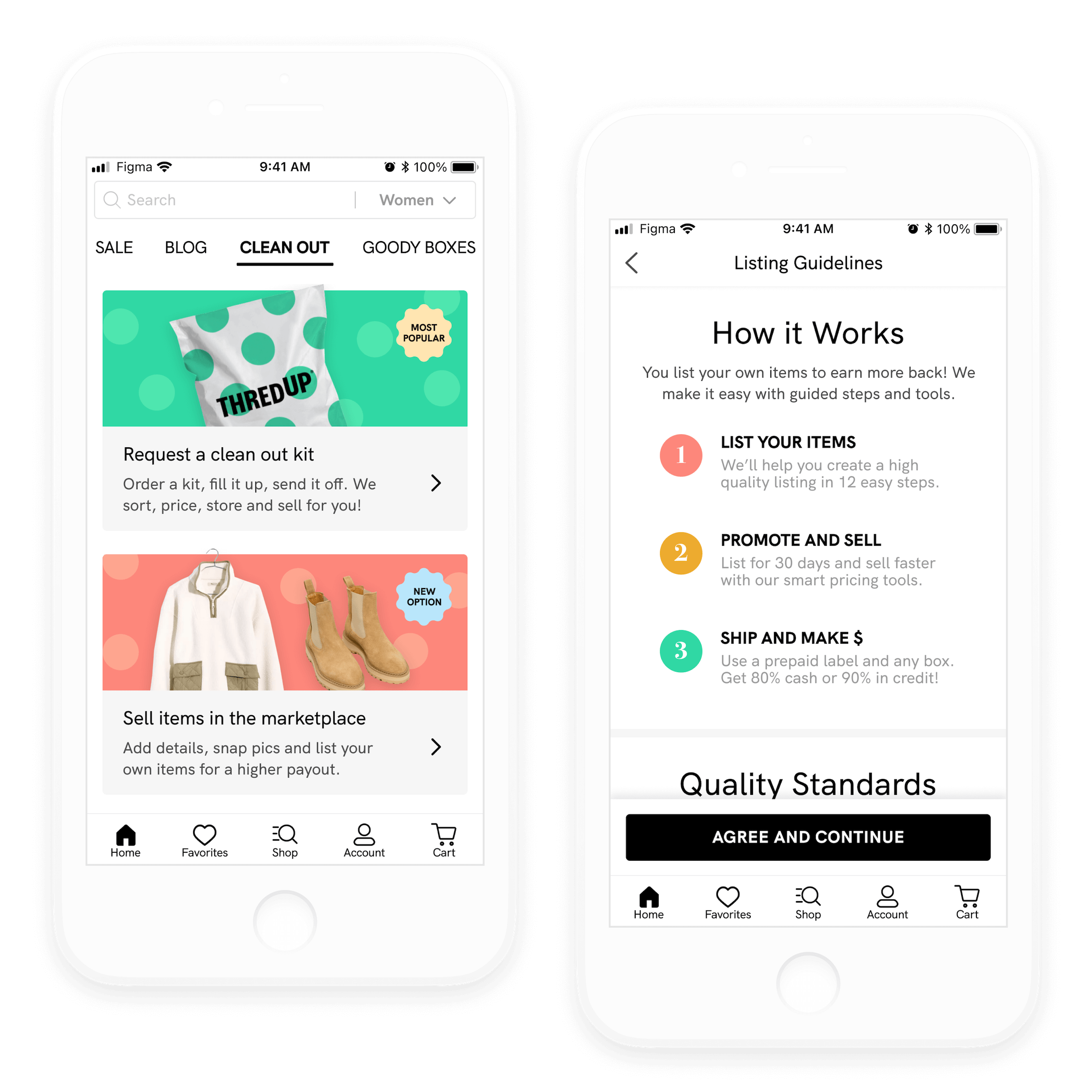
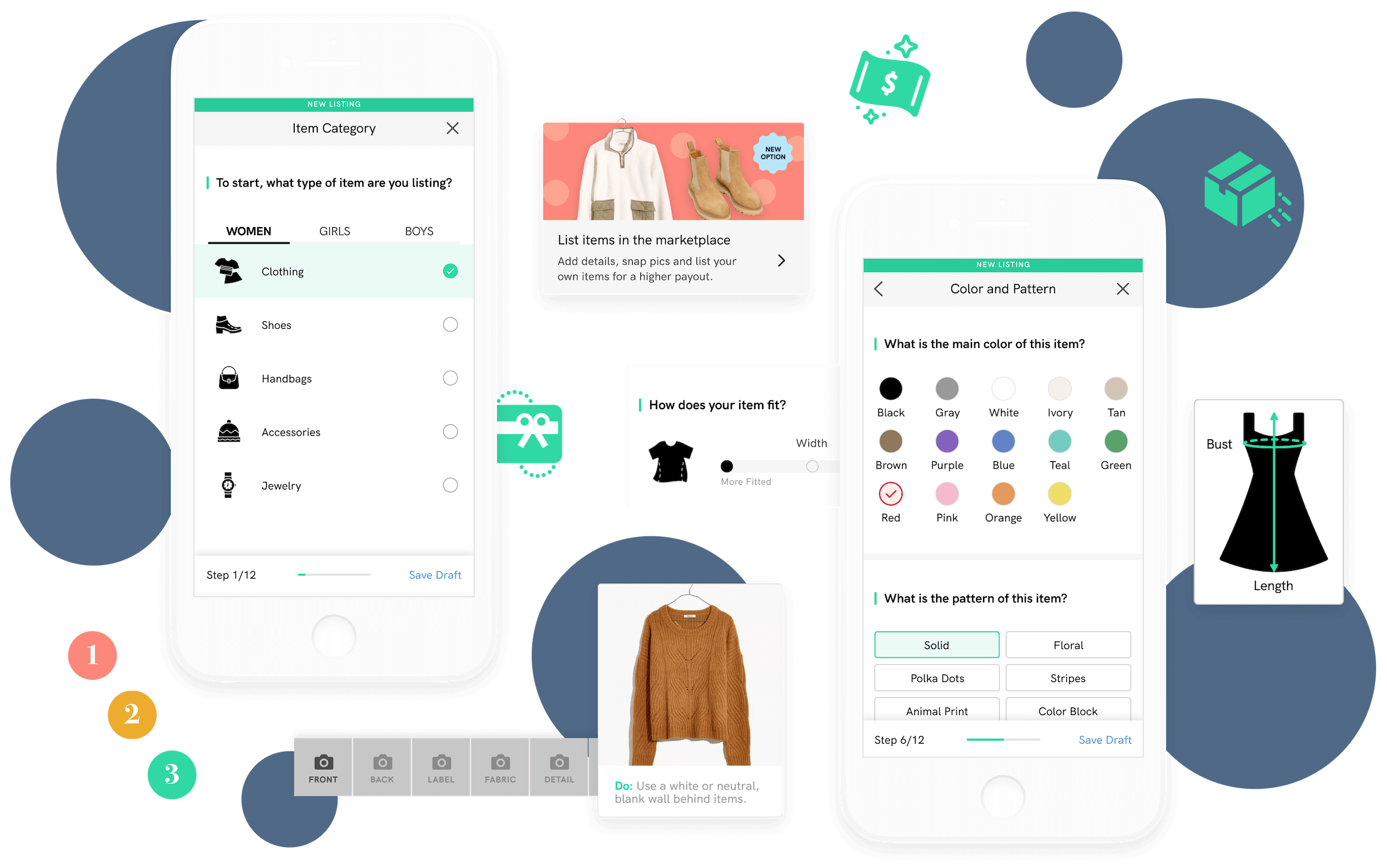
A guided-for-quality listing flow
Competitors keep forms short to make listing items feel fast — but that leaves users guessing or taking more time to research what information to include.
Over speed, thredUP optimizes for high quality listings that have all the details buyers need to purchase — increasing the odds of a successful sale on a seller’s first try. And while the flow has more steps, it also has more guidance, reducing any uncertainty-fatigue.
Not up to the task? A bit of healthy friction means some sellers will opt out — and straight into thredUP’s popular send-in-a-bag option.
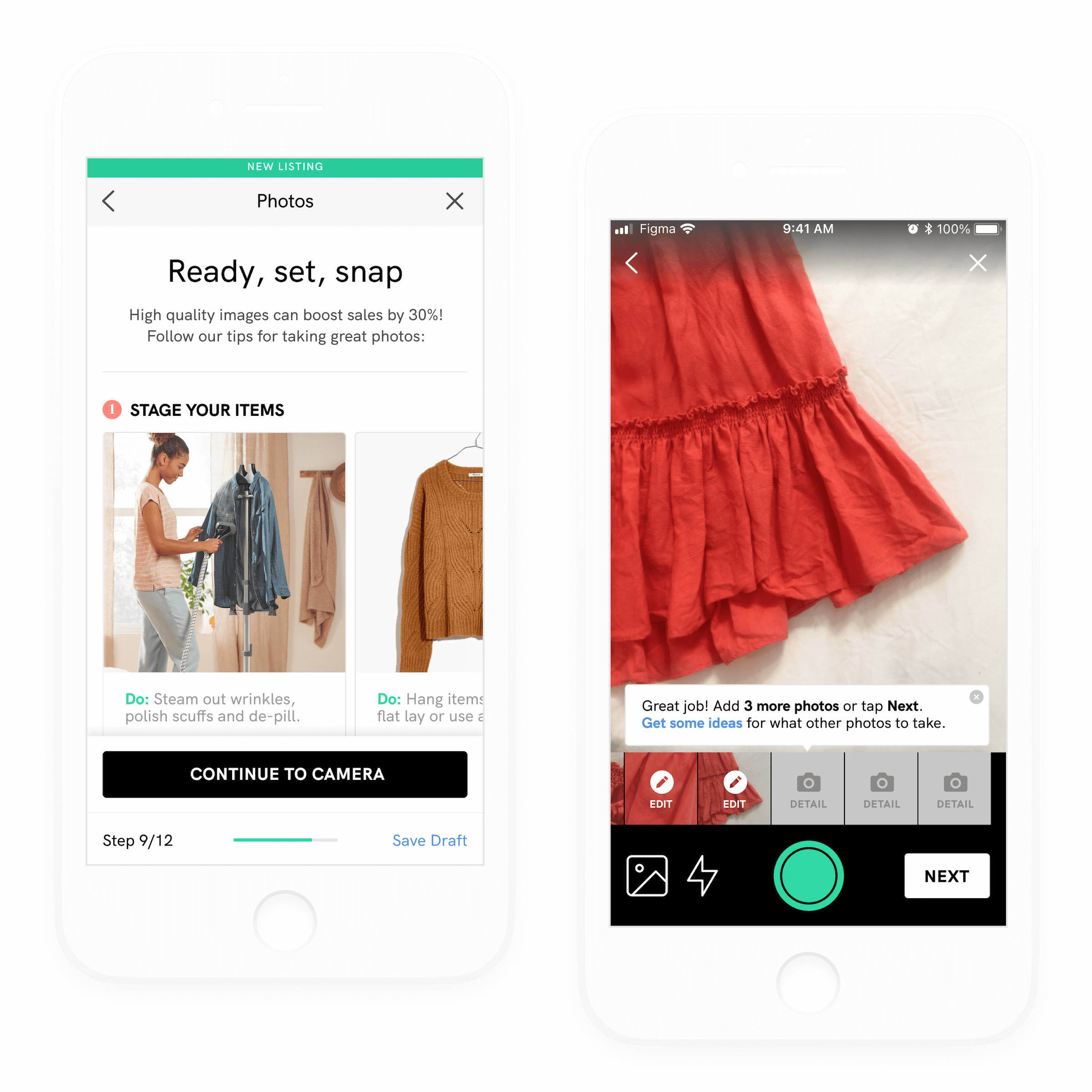
More data to power success
Adding to thredUP’s powerful shopping experience, items listed in the marketplace include more photos and helpful details that increase buyer confidence.
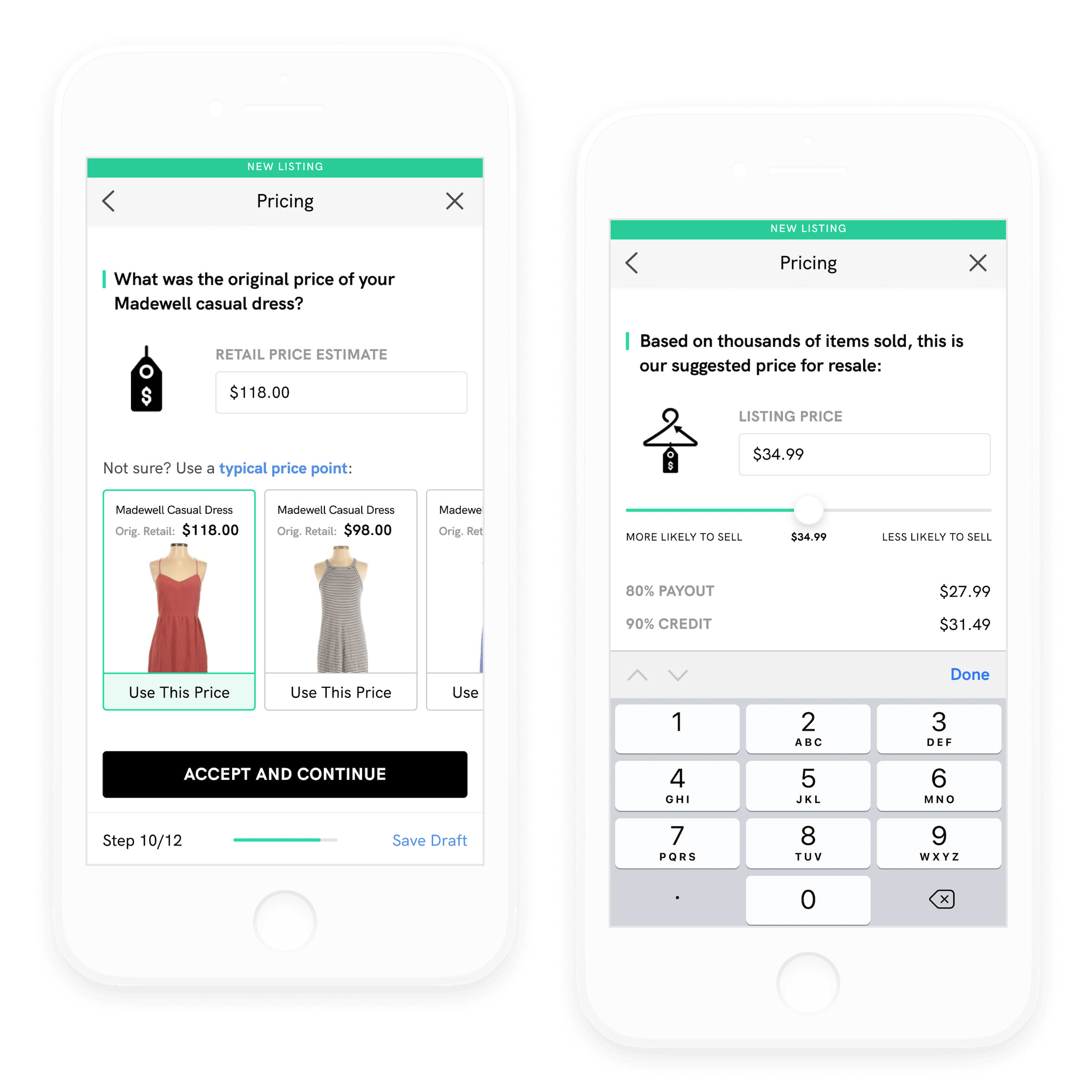
On the listing side, sellers not only have control over price, they see data-backed recommendations and promotion options, as well as visualizations on how pricing may impact conversion.
This “work smarter, not harder” approach combined with more transparency earns their customers’ trust, while ensuring stronger results for the business and brand.
Try out the prototype

The Process
All the nitty-gritty (but still summarized) details about how I got there.

Empathize & Analyze
Market Research
SME & User Interviews
Competitive Analysis

Define & Ideate
Goal Definition
Feature Roadmap
App Map

Design & Test
Wireframes
User Testing
Hi-Fi UI
Empathize and Analyze
As a longtime buy/sell/trade advocate and thredUP customer, I had my own mixed feelings about the experience. Overall, I loved it, but I had two key issues:
As a shopper, I felt like I had to wade through tons of styles I had no interest in — then when I did find something, I didn’t usually feel compelled enough to buy.
As a seller, sending in a bag was so easy, but I was frustrated by how little was taken, with no insight into why — or how much was taken, but how little I earned.

On the user side, I felt like the latter was the bigger issue — one that made me feel like exploring competitors.
However, I could see the case for the smaller payouts and changing policies over the years: a managed marketplace is expensive to scale, and what a seller doesn’t earn in cash, they make back in time and effort.
I wanted to balance addressing users’ pain points with business feasibility, so I started with some research. Did other users share my frustrations? How was the business — and greater market — thinking about buyers and sellers?
Understanding the market
I started at the thredUP website, digging into their annual impact reports. I also did a deep dive on Google and Youtube, discovering a culture of thrift influencers and professional resellers with candid insights.
Some key findings:

As demand grows, supply is the challenge
Secondhand is expected to double in market share over the next 10 years. While 82% of people haven’t sold clothing yet, their closets are filled with off-priced, value and fast fashion. Buyers are looking for deals on mid-priced specialty and higher end items, but also tend to hold onto those longer. If thredUP only takes ~40% of what is sent in due to level of wear and older styles, it’s likely that the most sellable items are under-supplied compared to the potential demand.

Resale faces a competitive future
Other resale platforms have proliferated, seizing on the opportunity to market consumers with sustainability, steep discounts on their favorite brands and ones typically out of their price range, as well as the ability to earn cash or credit. Marketplaces are either managed or peer-to-peer, and focus on luxury goods to mass affordability. Of the most successful players, Poshmark currently has the highest brand recognition (67%), over thredUP (44%) and The RealReal (12%).

TU’s payouts to sellers are very low
While thredUP’s own data cites making cash as the main reason people send in their clothes, their payouts are extremely low compared to competitors. If you resold a sweater for $20, you’d earn: $16 on Poshmark (80%), $6 at Crossroads (30%), and… $3 on thredUP (15%). You’d have to sell an item for $199 to earn 80% back — which means your item was originally $400+. While the difference comes down to convenience, the more tangible results feel like a big loss for sellers and a mismatch for their “mass” slice of the market.

The bedroom entrepreneur is on the rise
The C2C business model and the professional influencer/content creator are now common-place. In resale, Depop has captured a younger audience (90% under 26) who understand the power of social media and individuals over brand names in dictating trends. As more consumers become comfortable with selling items from their closets, they’ll be looking for a platform that offers them convenience and earning potential, as well as a trusted, enjoyable shopping experience for getting the best used items.
Getting business insights
From the market research, it was clear that I wasn’t the only one frustrated by the selling experience. But with dwindling payouts and stricter policies, I wondered how thredUP was thinking about this.
So I turned to a subject matter expert: an awesome designer at thredUP, who let me ask her some questions and replied as openly as she could. A few things I learned from our conversation:
O N A U D I E N C E
Lots of customers only shop or only sell; some do both
Sellers are either looking to get rid of things or looking to consign. Most don’t engage with the option to adjust pricing or reclaim items, so they assume it’s more of the former.
O N L I S T I N G T E S T S
They tested steaming clothes to created better product imagery, but it didn’t matter for conversion, so it wasn’t worth the extra operational cost
They tried removing measurements info (which is time consuming to collect) and it negatively impacted conversion, so they didn’t roll it out
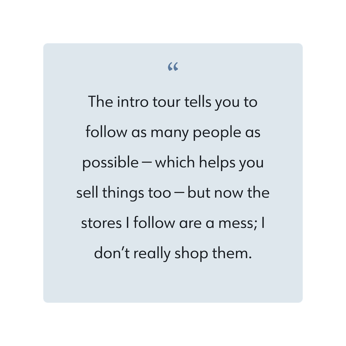
They created a profile + follow feature that improved buyer engagement, but didn’t move conversion due to issues with scaling their single-item inventory. They’re still interested in the community space, however.
Talking to consumers
Like any good discussion, I left the call with more questions — for example, if a customer “only shops” does that mean they don’t want to sell, or that they are simply selling elsewhere? And does a lack of engagement with pricing tools mean they’re not interested, or the current tools aren’t addressing their needs?
My SME noted that they had less time that they’d like for qualitative research, so I knew I had to go deeper with consumers to understand:
Who sells, who buys, and why?
What’s working for these users?
What could be better about the experience?
Why and how do they use the competition?
C O L L E C T I N G S T O R I E S
I was able to interview three thredUP users — one power user who shops a lot, one person who has tried it but prefers Poshmark, and someone newer to all online resale.
I also looked at App Store reviews, to find further evidence of met and/or unmet expectations. This helped me understand behavior and perceptions across a wider audience.
Using my raw notes, I created an affinity diagram and pulled out key learnings. I then worked these into more actionable user needs statements.
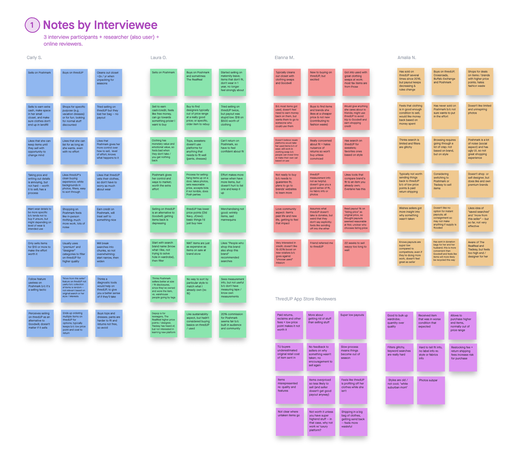
0 1 / L E A R N I N G
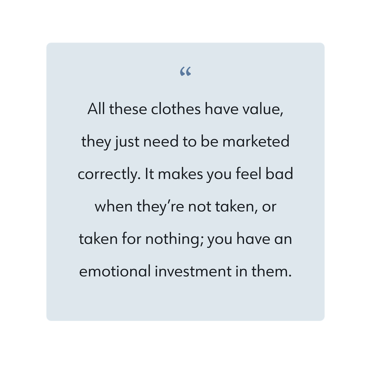
Items — and sellers — feel undervalued
Two participants had sold with thredUP before, but both reported feeling taken advantage of. One said TU accidentally disassociated her bag from her account after she’d sent in some really nice things. The other described her payout as “stupid low, something like $18 on $500 worth of clothes.”
The participant who was newer to thredUP was initially excited about earning some cash — until she realized that the payout percentage applied to the listing price, not the original price. For what she’d get back, she’d rather just give her nicer items to friends who’d appreciate them.
App Store reviewers echoed feeling like it wasn’t clear where untaken items went, or why some items weren’t accepted. People believed their items had real value, and with inconsistent pricing, steep fees to get items back, and low seller payouts, some felt like TU was unfairly profiting off their clothes.
= U S E R N E E D S T A T E M E N T
To stick with selling, people need to feel that the process is clear and that they are fairly compensated.
0 2 / L E A R N I N G
Better outcomes are worth the effort
The general sentiment was: have valuable items? Take them elsewhere. Participants felt TU was best for things that couldn’t be sold on Poshmark or gifted to a friend; a way to skip a trip to Goodwill and discard responsibly.
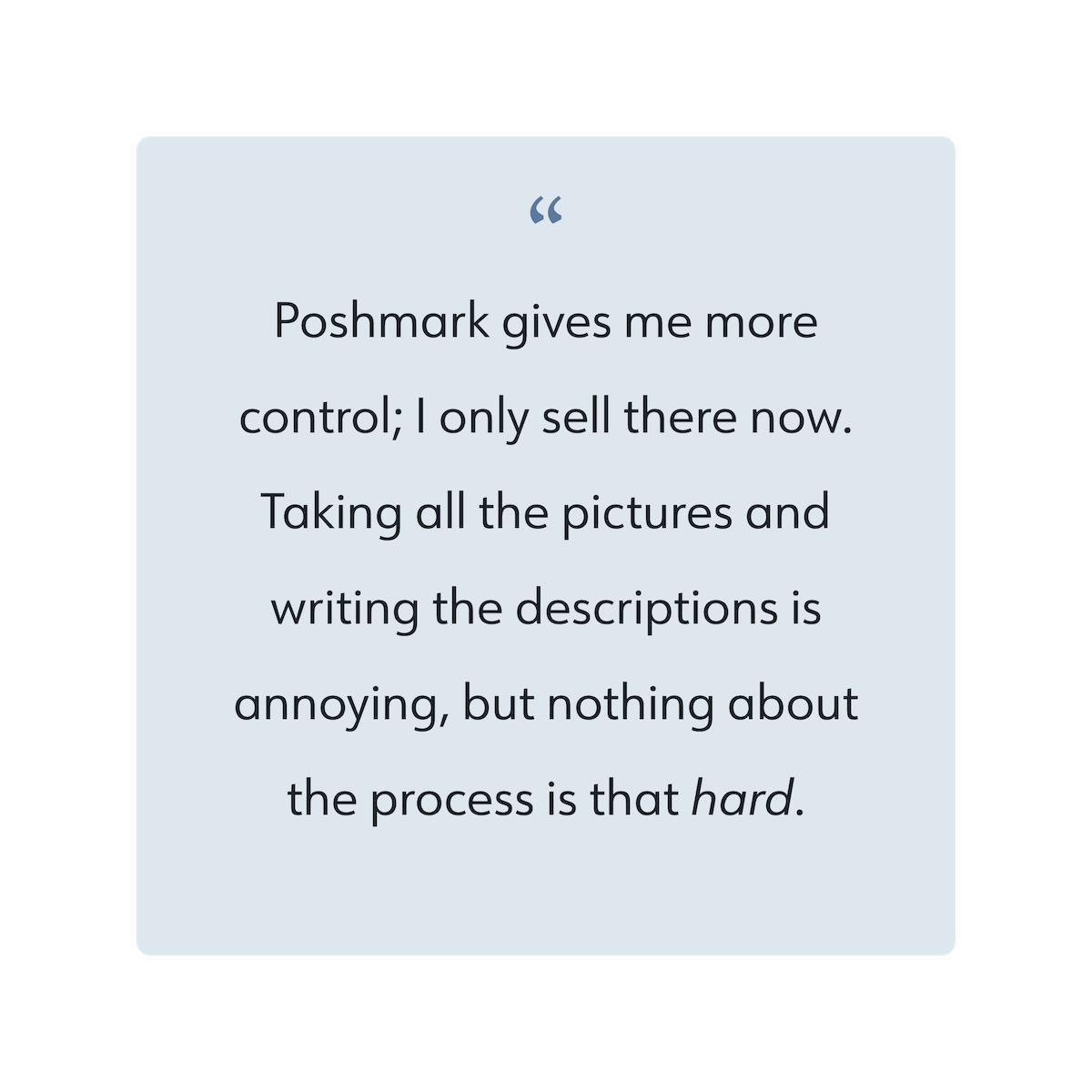
Two participants had moved over to Poshmark, where they felt like they had more control over their listings and were able to make more money back. Sure, they had to go through the process of taking photos and entering details, but it wasn’t so bad when you got into the flow. They came up with systems.
And even if an item didn’t sell right away, they could keep their listings up as long as they wanted, hold onto things until they sold, and even decide to keep something after posting it. Less risk, more chance for reward.
= U S E R N E E D S T A T E M E N T
Sellers need a balance of convenience to manage effort, and control to reduce risk of a painful outcome.
0 3 / L E A R N I N G
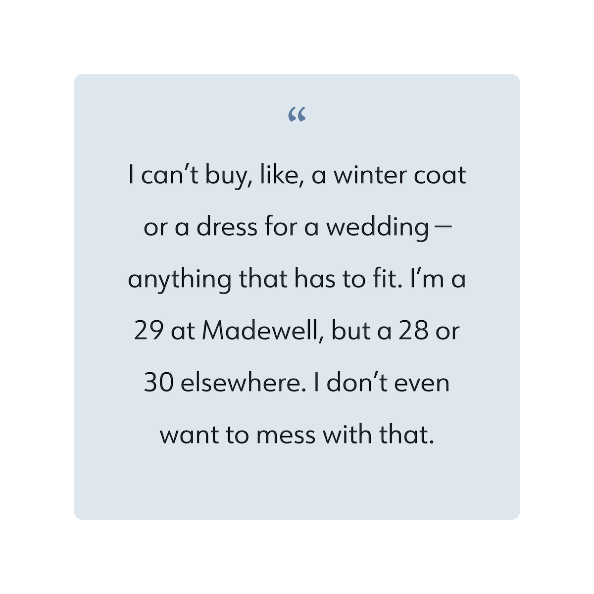
Uncertainty of fit and wear prevent purchases
Like pretty much all online shopping, you never quite know what you’ll get after ordering on thredUP. However, limited photos (front and back; no closeups), scant details, pesky restocking fees and a long wait before receiving selling credit make pulling the trigger harder — and often not worth it, despite low prices.
Participants cited similar concerns with competitor’s platforms, but noted that on Poshmark you can go back in forth with a seller to answer questions about fit and wear. The caveat was that returns were much stricter.
Additionally, while TU’s test found no conversion impact with steamed vs. wrinkled clothing, all participants noted that the current photos made items less appealing and made them question their quality.
= U S E R N E E D S T A T E M E N T
Consumers need enough details to build confidence and conviction before spending money or time.
0 4 / L E A R N I N G
Peer-to-peer can be… a lot
Participants had developed their own process for getting their items sold on Poshmark, from taking better photos to liking other sellers and attending “Posh Parties.” But they didn’t particularly enjoy the community feel; they felt it took a lot of effort, and made the shopping experience inconsistent and noisy.
Overall, two out of three preferred shopping on thredUP, citing a clean and organized aesthetic and powerful filters that made finding relevant items easier. While they liked that a Poshmark seller could provide helpful details, they felt they often didn’t upfront, and they trusted TU to “vet” an item.
The third participant perceived TU as a place with mostly fast-fashion so she wasn’t as interested, and she actually trusted sellers on Poshmark more to report wear and sizing details. But she also said she enjoyed shopping a higher end managed marketplace, The RealReal, for a “more elegant” experience.
= U S E R N E E D S T A T E M E N T
To enjoy the shopping or selling experience, people need a sense of order, consistency, accuracy and quality.
Defining who we’re building for
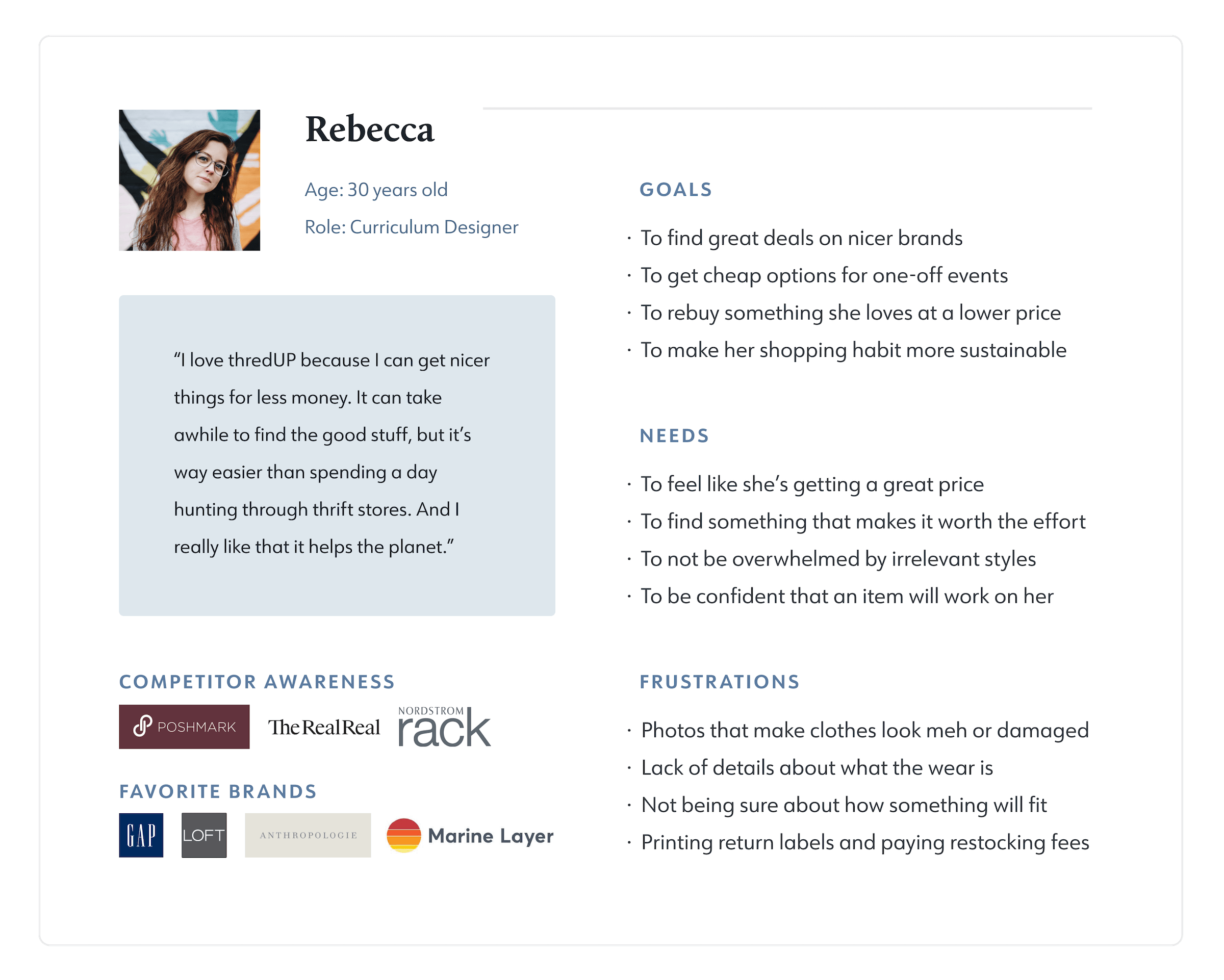
To keep myself focused on users’ needs throughout the rest of the project, I reviewed what I’d learned and created personas.
I knew that, even if this wasn’t the case today, the business could benefit from consumers both buying and selling on their platform. I would keep both group’s needs and experiences in mind while developing a new feature, to maximize overall impact.

Learning from competitors
Next, I moved onto reviewing competitors to evaluate their strengths and weaknesses and look for popular patterns.
Overall I felt that thredUP had the most sophisticated and enjoyable shopping experience, with powerful filters to make inventory less overwhelming and an organized, consistent aesthetic.
On the selling side, competitors had more lucrative and often simpler payout structures, with listing flows that seem optimized for speed. While Poshmark and Depop focused on social promotion to sell, Tradesy felt unique in their guidance and tools to make listings more effective.

Define and Ideate
I wanted a clear product vision and sense of priority features, based not only on users but the business as well. With that in mind, I took some time to go over my research and articulate the opportunity, goals and proposed solution.
The opportunity
ThredUP has the opportunity to be the leading one-stop circular fashion shop for Gen Z and Millennial consumers, but it depends on fostering relationships with fashion-loving, eco-conscious hobby resellers to ensure a competitive, relevant and mid-priced inventory.
Right now, TU sellers are increasingly dissatisfied with cuts to payout percentages, added fees, and little control over listings. With loyalty low and competition growing every year, more tech-savvy sellers are moving to app-based, peer-to-peer marketplaces like Poshmark, further empowered by the rise of “bedroom entrepreneurs” and influencer fashion.
To widen their reach and supply, TU has partnered with traditional department stores. But as market share for those retailers goes down (partly due to TU’s successful “buy used first” messaging), and operational costs of a managed marketplace go up, they’ll need a scalable solution that drives younger, higher quality resellers from the competition and retains them.


The proposed solution
Looking across our goals, it felt clear that a C2C marketplace option would benefit everyone. It could:
Provide a new supply channel without high overhead costs
Allow for more rewarding and competitive payouts to sellers
Collect precise listing details to sway more shoppers
Keep more sellers on TU instead of the competition
However, the question then became: what makes thredUP’s peer-to-peer marketplace different and better? Why would someone prefer to sell or shop there? I considered my user pain points and competitor opportunities, then wrote out statements to guide my solution.


Thinking through features
With a clearer direction for my project, I decided to limit scope to the new seller’s flow. I considered the goals and needs and wrote out some “how might we” statements to start generating ideas.
How might we...
Provide guidance and clarity?
Build trust, confidence and loyalty?
Leverage data to streamline and strengthen?
Balance user agency with quality control?
After some sketching, I moved my strongest ideas into a spreadsheet that I could add to and prioritize based on value and feasibility.

Organizing screens
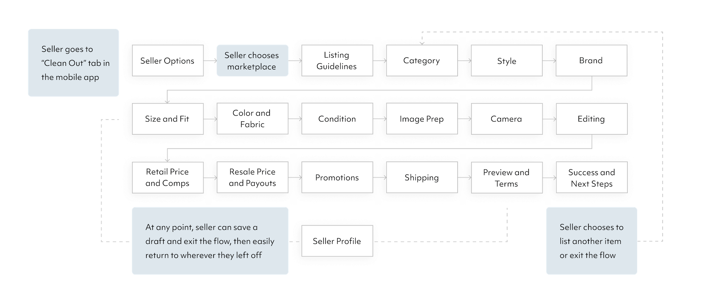
After deciding on key value props and features, I prepped for my wireframes by mapping out the new listing flow’s basic structure.
I referred to thredUP’s existing filters and categories to define what information needed to be included, then attempted to optimize based on where shoppers felt TU’s current descriptions were lacking.
Design and Test
With my roadmap, flows and pattern research handy, I dove into my wireframes. As I designed, I tried to keep these key principles (based on my “how might we” statements) in mind:
Provide guidance
Build trust
Demonstrate value
Make it smart
With a longer flow than competitors, the challenge was collecting a lot of information in a way that felt purposeful, potentially more rewarding, and as frictionless as possible.

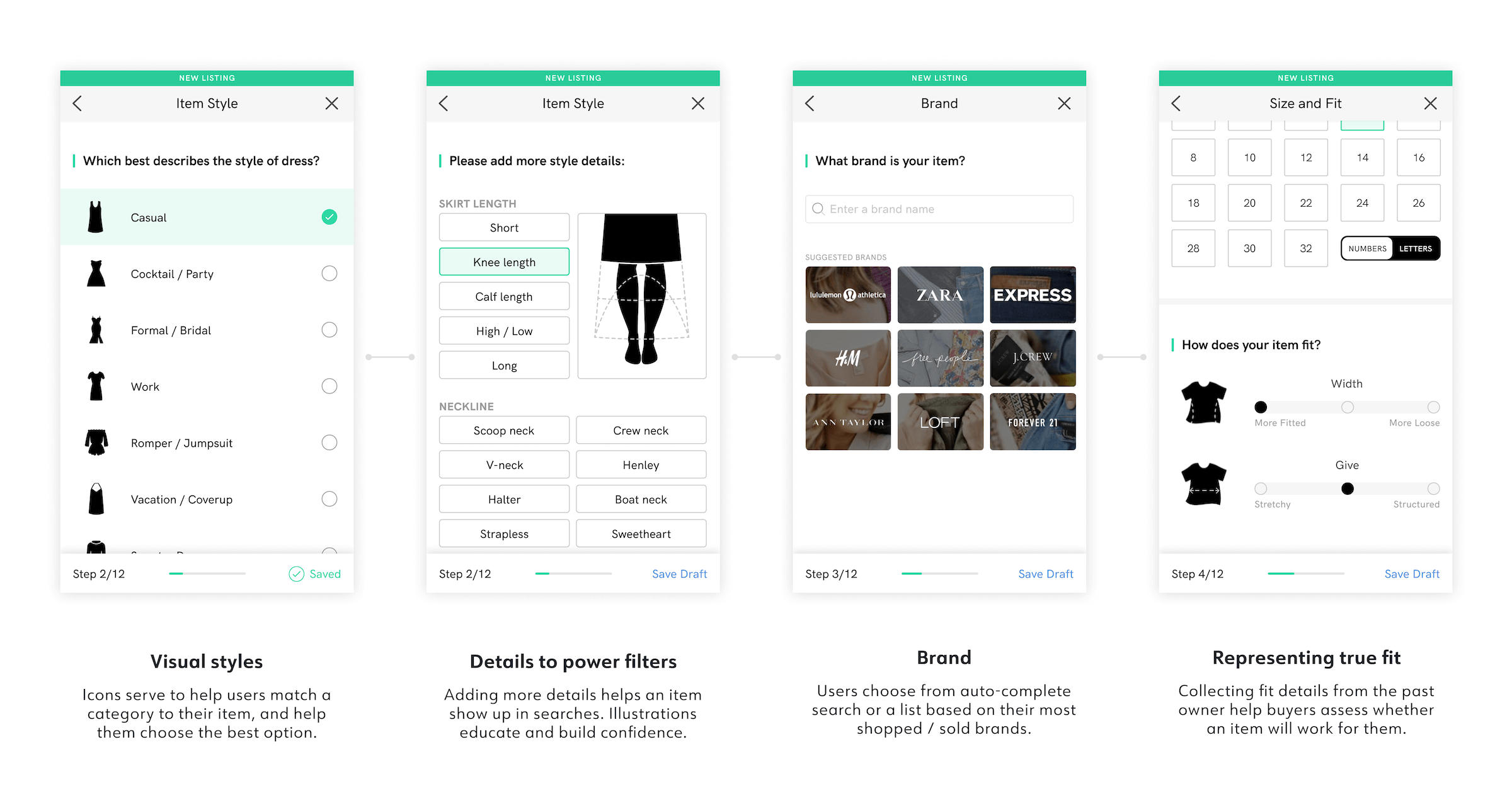
Adapting the UI
Because I was adding a feature to an existing product, I created a UI kit based on thredUP’s iOS app and used these patterns as much as possible in the hi-fi version of my new flow.
When adding brand new elements, I adapted them from similar styles and tried to keep colors and other visual assets on-brand.


Validating with users
I decided to test my prototype at mid-fidelity with participants who were familiar with other C2C platforms.
As a guided flow, it felt important to show users close-to-final copy and visuals, and I wanted feedback comparing the new flow to competitors.

W H A T W A S W O R K I N G
Participants consistently switched between their seller and buyer perspectives, able to justify more asks with the understanding of how those details would improve the shopping experience
In general, they felt that selecting from presented options was easier than typing in information
They reacted positively to built-in guidance, pricing suggestions, and help text to learn more
Percentages felt fair and they liked seeing their potential payout / credit with control over price
Shipping covered by the buyer along with a prepaid label from thredUP sweetened the deal
Revisions based on insights
Along with the good, there were also quite a few opportunities for improvement. I listed out the issues and prioritized revisions based on how critical they felt and how difficult they’d be to address.
Some key findings and changes I made:
I S S U E 0 1 / O R I G I N A L P R I C E
Participants skipped over the “typical pricing” suggestions

As expected, people didn’t really remember what they had originally paid for an item. Instead of asking them to break their flow and do research off the thredUP platform, I had added suggested pricing based on TU’s plethora of data and information already collected from the seller. However, people’s eyes jumped to the blue help text that addressed their immediate question: “Not sure?”
To alleviate some of the pressure, I added the word “estimate” to the form’s title. I also moved the phrase “Not sure” directly over the suggestions and added the visually compelling hyperlink to “typical price points.” Finally, I turned the suggestions into buttons to emphasize their purpose and add extra efficiency to the flow.
I S S U E 0 2 / A D J U S T I N G P R I C E
Why type when you can use a slider?

To encourage sellers to use data-backed prices, I added a visual representation of how pricing could impact a potential sale. Testers really liked this and said it made them feel more confident about the suggested price and more wary of overpricing. When asked how they might change the price, they all tried to use the “slider” (the dot was misleading).
In terms of efficiency, they were totally right — using a slider would remove the need to type in different price points to see the result. A slider also had the added benefit of suggesting multiple price points, as well as setting a min and max price. This would gives sellers control, but help the business encourage reasonable price points for shoppers.
I S S U E 0 3 / T H E W R O N G T O N E
Participants were annoyed by “more discounting”

This was an example of how simple copy tweaks could drastically change a user’s feeling towards a brand. When participants read “How would you like to discount this item?” they felt like TU was asking them to discount their valuable item again, after they’d just agreed to a resale price that was much lower than what they paid (their anchor point). Changing “discount” to “promote” made the headline about getting their item sold successfully instead of cutting into their payouts.
People also liked the second option when they read “based on time listed,” so I changed the title to emphasize that aspect. Plus, I was wary of labeling any tactic as “smarter” than the thredUP sales option (which was most valuable to the business).
Taking it Hi-Fi
To keep things consistent and speed up the process of generating final screens, I followed the atomic design methodology, building reusable components. I also found, adapted and created visual assets to bolster users’ clarity and confidence, and add some delight.


Try out the listing flow
Next steps
A few things I might do if I were to spend more time on this project…
Reducing time to completion
I included asks based on what categories / tags thredUP seemed to be using already, plus information that addressed shoppers’ concerns. However, I’m sure TU has data on which filters are most-to-least used, which could help us cut less necessary asks. With further testing after launch, we could optimize for the right balance of information collection, considering seller completion rate and shopper conversion rate.
When you complete steps in the prototype, most of the screens automatically progress to the next. The exception is on screens where it’s likely you’ll make edits or you must “agree.” I did this to make the flow feel faster and smarter (no need to keep tapping “continue”), but I would want to further test this interaction to ensure users experienced it that way, rather than feeling a lack of control.
Incentivizing completion
Taking quality photos still takes time and effort outside of the platform. Unlike competitors, I decided to ask for images mid-way through the flow because they can feel like the most daunting step, and users might be more incentivized to complete their listing once they’ve already entered a certain amount of info. Beyond the in-app tips and basic editing tools, and considering people’s different physical environments, what else might we do to encourage high quality product images?
The value prop is to get sellers’ stuff sold more consistently, more quickly and with less ongoing effort, once they go through the steps — but how might we demonstrate more of that value earlier on? Would we feature success stats and testimonials? If some fields were presented as optional, could we reward a seller with more points or credit based on the number of asks they completed? Or could we visually present progress in a more captivating, rewarding-feeling way?
View more projects

Love School Website

A new Overview for project44