L O V E S C H O O L
Making high quality coaching
more accessible
The Challenge
Aaron FS, a professional relationship coach, was developing an online video course on communication. Over the past 10 years, he had supported thousands of people through his private practice and group classes, but kept seeing the same issue: poor communication habits and behaviors that fostered division and resentment instead of connection and love.
After developing a model of education, he needed a marketing website that communicated the value of taking the course and encouraged people to enroll.
H I G H L E V E L G O A L S
Design a responsive landing page
Develop positioning to educate and convert
Define a visual identity for the brand
R O L E
UX Research
Product Design
Brand Design
Copywriting
S C O P E
Client Project
Web Design
T O O L S
Figma
Procreate
The Solution
The TL;DR version. Scroll on for a more chronological unfolding of events…
Promoting access and quality
While the stigma has lessened, barriers to getting support remain, from concerns about cost (money and time) to safety and efficacy.
With accessible pricing, a peaceful color palette, welcoming imagery and a genuine tone, Love School meets people where they are, taking their concerns seriously while giving them hope.
Unlike competitor’s uninspiring or out-dated websites, a clean and thoughtful aesthetic conveys professionalism and legitimacy — instilling confidence in quality, despite the extremely affordable price point.
Personalized for greater impact
A video-course risks feeling shallow and “one-size-fits-all” — how much can it really help when relationships feel so unique and personal?
A free quiz to generate a custom course path helps potential customers understand how the curriculum applies to their relationships, and empowers them to address their most immediate needs first.
Office hours and Q&A resources provide more support and depth. Diverse testimonials and a money-back guarantee make it clear that successful outcomes are prioritized and within reach.
An easier way to get started
Searching for support can feel like looking into a void — what will it be like? Will their style work for me? The uncertainty takes up time and energy, and prevents people from taking the next step.
Instead, what if we anticipated people’s questions, answered them openly, and made it easy to get started?
With clearly labeled sections, video previews, comparisons, FAQs and predictable routes to learn more, a potential customer can build trust and conviction. When they finally see an ask to enroll, they’re ready to say yes.
View the hi-fi designs
The Process
All the nitty-gritty (but still summarized) details about how I got there.
Empathize & Analyze
Market Research
User Interviews
Observations
Define & Ideate
Feature Roadmap
Sitemap
UI Requirements
Design & Test
Wireframes
User Testing
Hi-Fi UI
Empathize and Analyze
To understand what the design should solve for, I needed to figure out:
Who is the audience for this service?
What are their goals, needs and challenges?
What are the perceived strengths and weaknesses of the offering?
What are competitors doing well, and what are the opportunities?
Understanding the market
After interviewing my client to learn his perspective, I did some research on attitudes and trends regarding therapy, counseling and coaching for individuals and couples. This helped me ground myself in the space and validate some of our assumptions about our audience.
52% of adult Americans
believe therapy is hard to get
Of those who wanted treatment, the top three reasons why they didn’t end up getting it were cost (39%), the belief that their problems weren’t serious enough (35%) and skepticism as to whether it would work (32%).
Women and younger generations
are more open to support
Men are twice as likely as women to say they don’t trust therapists. Statistics also point to decreasing stigma among younger generations: 21% of Millennials and 16% of Gen X are engaged in therapy, compared to 8% of Boomers.
Affordability and expertise are
what people are looking for
When asked which attributes are important in choosing a counselor, people cite affordability (46%), specialization or expertise (42%), years of experience (34%), positive reviews (22%) and convenience / proximity (18%).
Couples often wait too long
before getting help
Research shows that couples wait an average of 6 years, but certain negative behavior patterns can predict divorce within 5.6 years post-wedding. Of the 21% of couples who seek counseling, 70% say they benefited from it.
Getting to know consumers
For a more complete picture of potential customers, I decided to conduct interviews. Based on my client’s insights and my own research, I created a screener survey to focus on people who were:
Ages 28-40
In a committed relationship or marriage for 1-6 years
Currently facing issues of repeated arguments, questions about long-term compatibility, feelings of inequity or not being heard, and/or wanting more from their partners and their relationship
The interviews uncovered shared perceptions and behavioral patterns that we would need to either combat or leverage in the design.
From the raw data, I pulled out key learnings and created more actionable “how might we” statements to share with my client and help us start brainstorming.
0 1 / L E A R N I N G
To seek support, the need must feel immediate and the path easy
Everyone agrees on the benefits of getting help. They think about it regularly after arguments or while considering big life changes — but they don’t do it.
Why not? While the surface-level stigma of therapy has lessened, the investment is hard to justify unless the need feels acute and immediate. There’s the financial cost, a difficult partner who needs persuasion, the extra time and energy they have to put in… And once the pain from an issue has dulled, it feels like things are looking up — is now the right time to “rock the boat”?
Of those who do seek support, whether they’re facing a big conflict or wanting to make a proactive investment, the long-term benefit was made clearer through a friend or family member’s experience, and the path was made easier after getting a recommendation from a trusted source.
H O W M I G H T W E . . .
Remove barriers on the path to taking the next step?
Make getting support feel more urgent and necessary?
Leverage the power of trusted recommendations?
0 2 / L E A R N I N G
An online course wins in convenience, immediacy, choice and privacy
People overall found the idea of an online course appealing. The ability to do something at your own pace, on your own schedule felt extremely convenient, with the potential for more instant access to support when you need it.
Compared to traditional therapy, people liked being presented with a wider breadth of resources upfront, covering things you hadn’t thought to bring up and giving you a choice of what to focus on. This felt especially valuable when paired with an assumed lower price than typical 1:1 sessions.
Finally, being able to learn from a coach at a healthy distance — without sharing personal details or risking partisanship towards one partner — and through a program with a clear end goal felt like a much lower-risk way to get started.
H O W M I G H T W E . . .
Highlight convenience and the potential for immediate impact?
Present the value of having breadth + choice and autonomy?
Lean into the idea of privacy, safety and getting started?
0 3 / L E A R N I N G
An online course loses in personalization and efficacy
While a course could provide breadth in a compact and affordable package, people firmly believed that a traditional 1:1 relationship would provide more depth and a stronger outcome. A course could only go so far.
They felt that their relationship dynamics were unique and that the details were important for the treatment. That a coach could help them go deeper, articulate how they feel and point out what they may be missing — not to mention, hold them accountable for showing up and doing the work.
And while a course is more private, an IRL moderator could create a safe space when working with your partner, so you could open up and feel heard.
H O W M I G H T W E . . .
Make “best practices” feel more personal/personalized?
Fairly and persuasively compare the course to traditional support?
Help people feel supported and set up for success?
0 4 / L E A R N I N G
Coaching is perceived as positive and actionable, but less credible
When asked about the differences between therapy and coaching, people were able to articulate pros and cons for both.
While therapy sparked the image of a passive practitioner asking you, “And how does that make you feel?,” people described a coach as an expert that gives you advice and cheers you on. Coaching felt more interactive, actionable and holistic, looking less at your past, but more towards your present and immediate goals.
On the other hand, therapists were perceived as more qualified and thus more capable of deeper discovery and addressing more serious issues. With coaching less regulated, people were concerned about the quality of a coach, especially when it came to convincing their partners to see someone.
H O W M I G H T W E . . .
Lean into positive perceptions of interactivity and action?
Instill confidence of credibility, quality and efficacy?
Persuade not only the reader, but also their partners?
Learning from competitors
The second half of the interviews were dedicated to observing participants while they reviewed competitors’ websites. Participants were asked to “think aloud” and explain what they liked or disliked about visuals, copy and product offerings.
Understanding what competitors were doing well or less well helped inform what type of content and patterns we should avoid, follow or improve upon in our design.
K E Y O P P O R T U N I T I E S
Signaling quality: Low prices + clutter make people question value
Promoting clarity: Clearly describing the offering and organizing info
Putting people first: Early calls to purchase make it about the sale
Welcoming thoughtfully: Content can easily strike the wrong tone
Adding validation: Testimonials and free previews build confidence
Defining the audience
To keep us focused on user needs as we scoped out the course website and product, I collaborated with my client on three personas based on the research and his experience.
Because the course was being designed for individuals and couples, we felt it was important to include people who would take it on their own, as well as partners that would take it together.
Define and Ideate
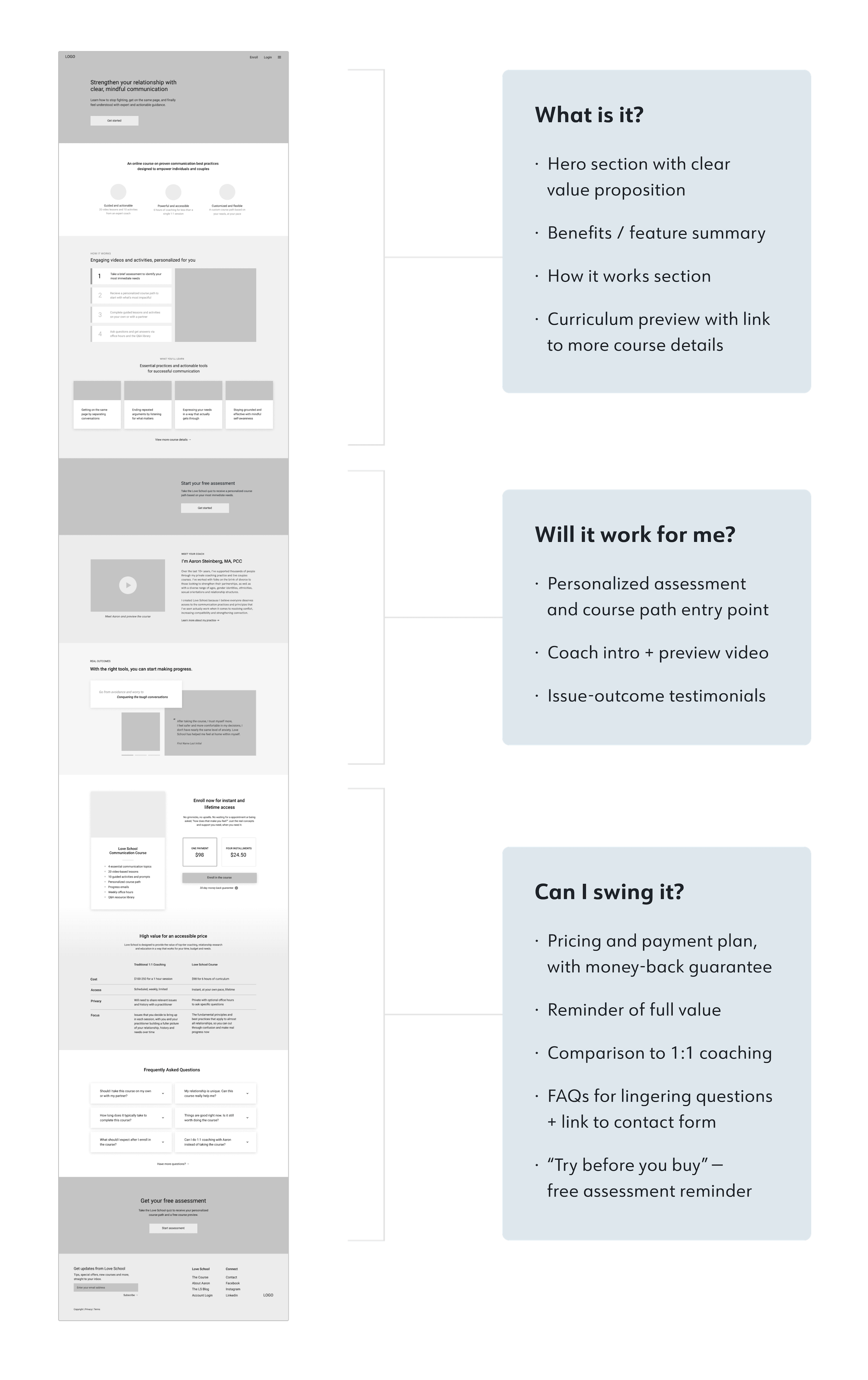
Based on the research, there were three main questions standing between someone landing on the page and deciding to enroll:
What is the course?
Will it help me and my situation?
Can I swing it, considering my time and budget?
In order to compel customers to take the next step, we would need to answer these questions clearly and quickly, and in a more effective way than our competition.
Thinking through features
I reviewed our “how might we statements,” personas and competitive research to generate a list of feature ideas across the page and the course experience.
After presenting my recommendations to my client, we discussed feasibility issues, scope and prioritization for our MVP, resulting in a product roadmap.
Outlining pages
Next, I broke down the project structurally.
Based on competitors and observations, I proposed one longer-form homepage that addressed the majority of questions, with secondary pages for additional details.
To optimize for first-time visits and keep focus on the homepage journey, I made the header navigation simple, with only key actions and a more menu.
Design and Test
With an initial focus on the homepage design, I created a UI requirements document, wrote some copy and started wireframing.
Removing uncertainty
I wanted users to feel like their questions were anticipated and answered as they scrolled down the page. By the time they saw the low price, they wouldn’t need to justify whether the purchase was “really necessary” — enrolling would feel obvious, easy and valuable.
Building interest
The challenge was answering the right questions at the right time and presenting the details in a compelling way, whether someone was just scanning headlines or reading every line.
Incorporating client feedback
While I felt good about V1, my client pushed for including more details, which resulted in very text-heavy sections.
After several drafts of copy and changes to the wireframes, I was concerned that the content was starting to feel overwhelming instead of compelling, and that we were moving farther away from what we’d learned from the research.
Testing with users
I was mindful about making decisions based on my customer, instead of his customers, so it felt like the right time for some user testing. To address my client’s concerns and optimize the flow of the page, I decided to run a sorting activity.
I provided participants with sections of the wireframes and asked them to put the pieces in an order that made the most sense. I observed these sessions, asking participants to think aloud and describe their process.
Clear trends showed up in the results, validating some things while providing me with insights about what to cut or change — and helping me create buy-in with my client, so that we both felt good about V4.
P R I O R I T Y R E V I S I O N S
Quiz experience moved UP
People went “ooh” when they saw the assessment offer and placed it towards the top. So we added it directly after the highest priority details, then again at the end.
Coach details moved DOWN
They wanted to check out the coach, but only once they’d been convinced of the content’s relevancy.
Cost details moved UP
People feared scrolling and getting invested only to find out the course was out of budget, so we added cost details to the benefits summary to assure them.
Less important sections got cut
If it was hard to place, it got the ax. For example, the issues-to-outcomes section moved around but was always followed by testimonials. I decided to edit it down and merge them together.
Envisioning a brand
As I was making headway on the UX, I was also thinking about the brand and UI. The client already had a logo and name he was attached to, but everything else was up for grabs.
I started by isolating the “how might we statements” that I believed I could address and strengthen visually:
How might we…
Lean into the appeal of privacy, safety and accessibility?
Make the offering feel more personal/personalized?
Instill confidence of credibility and high quality?
Persuade not only the reader, but also partners?
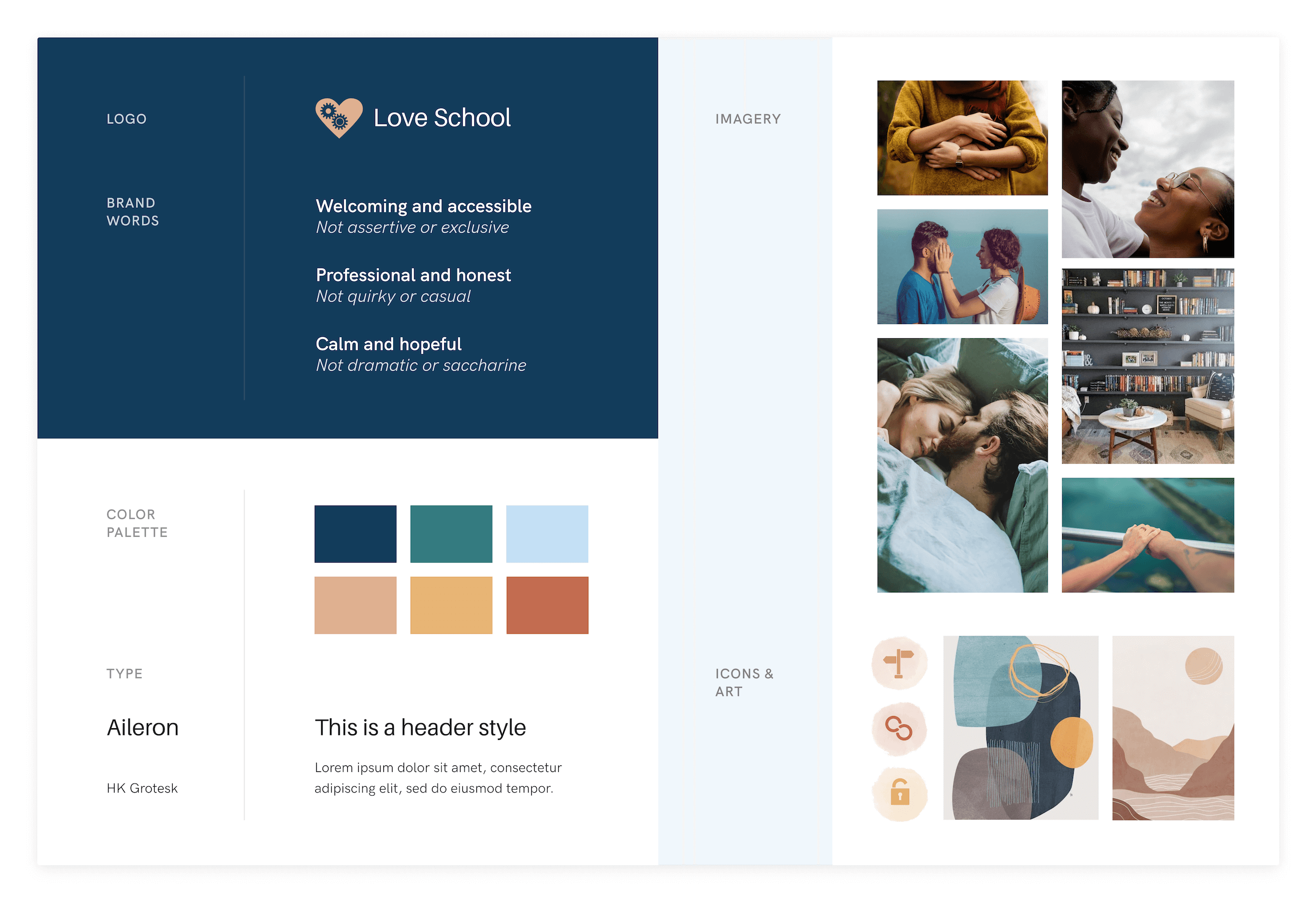
I defined some brand words, created a mood board on Pinterest, then developed a style tile to present to my client.
A calming aesthetic
Picture the ideal therapist’s office: professional, but warm. A place where you feel comfortable sharing, confiding and working on issues, but that you leave feeling more calm and hopeful.
Welcoming imagery
Images of other couples serve to normalize getting help, and balance a more serious tone with an aspirational outcome. No matter someone’s situation, they’ll be welcomed and supported.
Authenticity + quality
The type is clean and confident, but still feels human. Lush blues makes the offering feel valuable, while generous whitespace, muted pastels and organic textures keep things approachable.
Taking it Hi-Fi
After nailing down the direction, I applied visual styles to my wireframes and built out components for consistency and efficiency.
I created responsive screens for desktop, tablet and mobile and shared the final designs with my client — who was extremely happy with the outcome.


